
A piece of Vienna, freshly served: wienerin
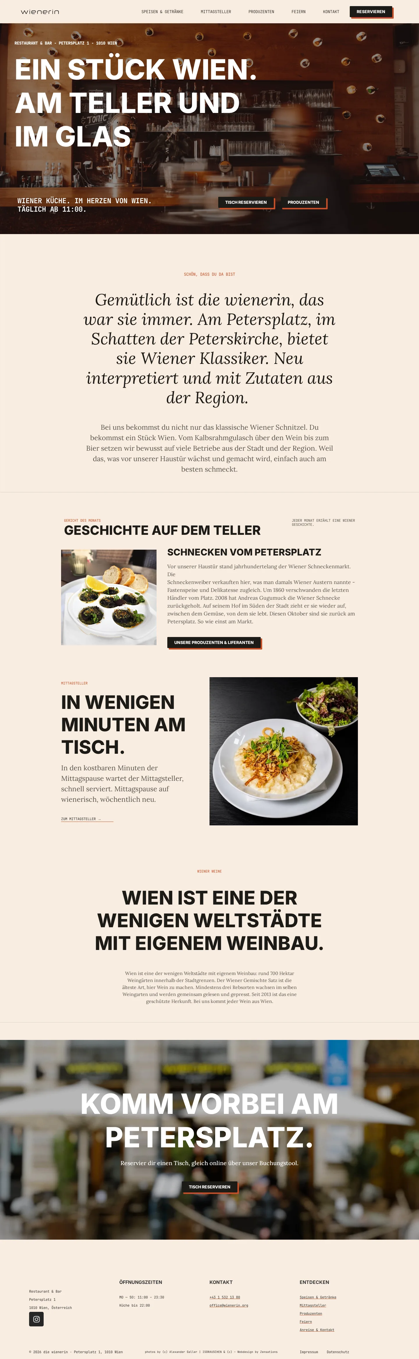

wienerin on Petersplatz, in the shadow of St. Peter's Church, has always been a cosy place for Viennese classics. Its brand presence, however, had aged. The goal was to modernise the venue, position it clearly and build a brand that shows what wienerin stands for: Viennese cuisine, reinterpreted, with ingredients from the city and the region.
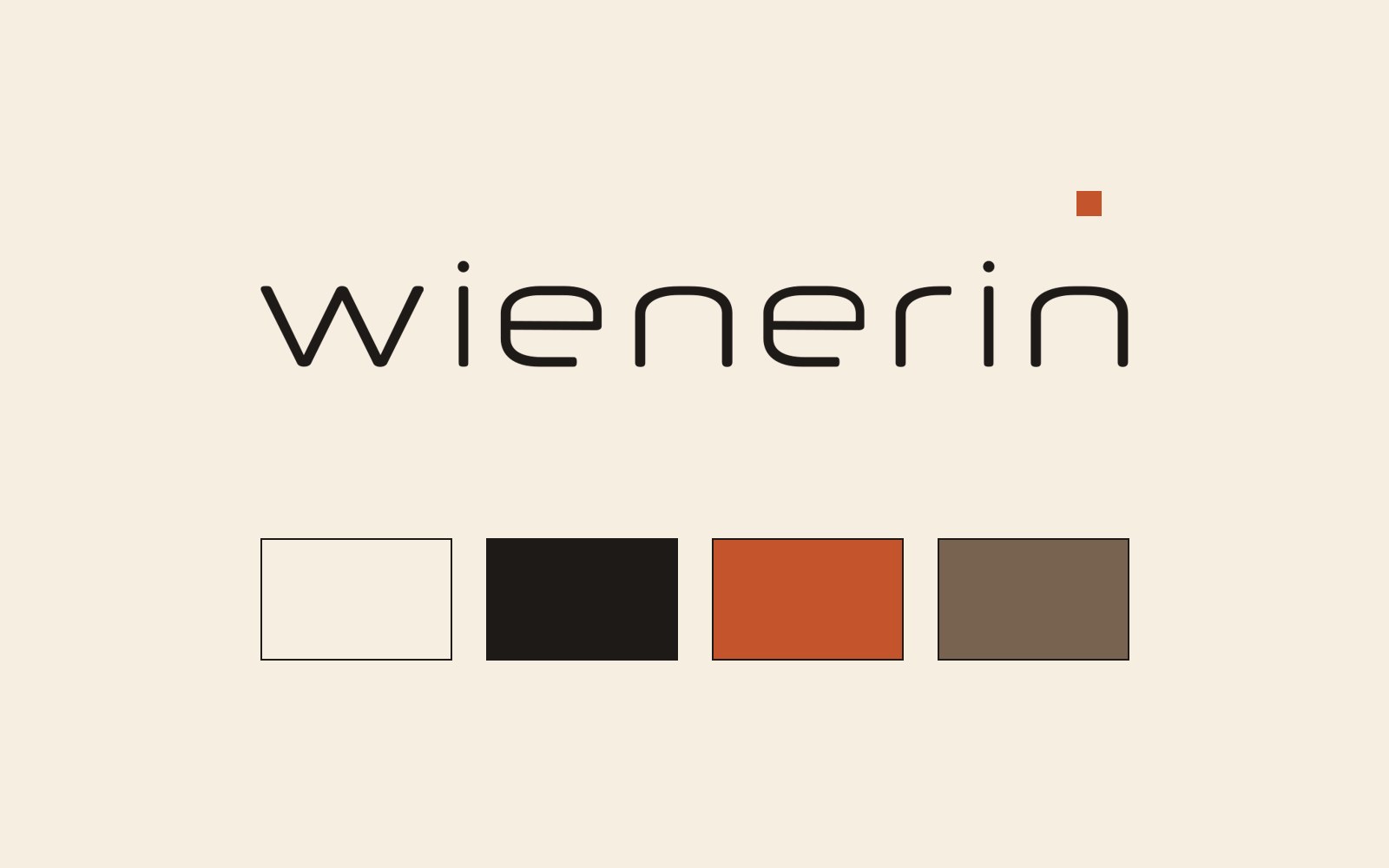
It started with positioning: "A piece of Vienna. On the plate and in the glass." From that line Zensations developed the new corporate design. The logo is a reduced, rounded lowercase wordmark, contemporary and unpretentious. It is paired with warm cream, deep black and a strong rust red, plus typography that combines poster impact with the charm of a menu card.
The new website is state of the art: mobile first, fast, structured for search engines and AI answers, with clear paths to table reservations. Food & drinks, lunch plates, celebrations and the regional producers each get their own section. The "dish of the month" tells a Viennese story every month, such as the snails of Petersplatz, making the site a place people like to come back to.
And it continues: the social media presence is launching right now, carrying the new design onto Instagram and beyond. Templates, imagery and recurring themes like dish of the month, lunch plates and celebrations keep wienerin as recognisable online as it is on Petersplatz. A restaurant becomes a brand: a piece of Vienna you can feel digitally, too.


Let's talk about your project.
Whether it's a new website, AI in marketing, or a full relaunch, we listen and deliver a clear path forward.
- Reply within 24 hours
- Free and non-binding
- A concrete proposal instead of a sales pitch